{
location < 3, 4, 5>
look_at < 0, 0, 0>
}
light_source
{
< 20, 40, 80>
color rgb < 1, 1, 1>
}
sphere
{
< 0, 0, 0> 1
pigment {color rgb < 1, 0, 0>}
}
This page provides an introduction to the free rendering engine POV-Ray with a special focus on its applications in modelling maille. As POV-Ray works by interpreting a text file containing a specialized programming language, code that can be put into POV-Ray is represented in blue. Certain special keywords will be represented in red text.
First off, download and install POV-Ray. The program is free and works on just about every platform imaginable (excepting perhaps your PDA). You can download it from the official POV-Ray website. I will not help people with installation or platform-specific questions. I do my work on a Macintosh and the interface is markedly different on other platforms. If you're using a PC, you should be able to find what you need in the documentation. If you're using a *nix platform, then I have faith in your ability to figure such things out on your own.
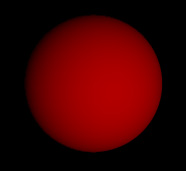
As I mentioned above, POV-Ray's engine works by interpreting a text file. Based on what it finds in the text file, it will place various objects and then render them (rendering is the process of actually creating an image). Let's take a look at one such file now. The code is on the left, the image it generates upon rendering is on the right.
|
camera { location < 3, 4, 5> look_at < 0, 0, 0> } light_source { < 20, 40, 80> color rgb < 1, 1, 1> } sphere { < 0, 0, 0> 1 pigment {color rgb < 1, 0, 0>} } |
|
Perhaps a trifle boring, but then, we don't want to start too complicated or things will get confusing. Quite possibly they already are confusing. Let's take a look at what we've made here.
First off, there's the camera. The camera can be considered to be your eye
into the world you're creating. Although you can do all sorts of fancy things
with the camera, typically all you need to specify is where it is in space and
what it's looking at. Appropriately enough, these two things are defined by
the location and look_at
lines. The location line determines where the camera lies in three-
dimensional space by using a vector. Vectors
are incredibly common in POV-Ray, and provide a convenient way of grouping our
three dimensions (actually, more than three values can be used in some cases,
but the vast majority of vectors are three-dimensional).
A vector takes the form < x, y, z>
, where x represents distance in the X direction, y in the Y direction,
and z in the Z direction. So the line
location < 3, 4, 5>
says to put the camera three units in the X direction, four in the Y direction,
and five in the Z direction. Then the line
look_at < 0, 0, 0>
tells the camera to look at the location where X, Y, and Z are all zero. This
location is known as the origin, and serves as
a convenient reference point for much of our work.
That's a lot of work for the camera. But then, we have to lay a fair amount
of groundwork here as we go. The lightsource should be simpler. Lightsources
provide that thing without which our images would be rather hard to see -
light. The basic lightsource, like the camera, has a location. It also has a
color. But that's it. Although you can get fancy with light sources, there's
usually not much of a need. The simple version will work fine. Looking at our
light source, it shouldn't be too hard to figure out that the vector in front
is the light's location (at 20 X, 40 Y, and 80 Z). The
color keyword that follows it is used to specify a particular color in
the RGB spectrum in this case (thus the "rgb").
The RGB spectrum is a convenient
way to specify a given color by how much of the three colors red, green, and
blue the color contains. These colors can simply be represented in a standard
vector, where the amount of red takes the place of the X value, green the Y
value, and blue the Z value. Thus the line
color rgb < 1, 1, 1>
indicates a color that contains equal values of red, green, and blue - a grey
color. As the values are all 1 in this case, that grey color happens to be
white. Thus, what we have here is a lightsource at the location 20 X, 40 Y, and
80 Z, creating white light. That's not so bad, is it?
Of course, now that we have an eye to see with and light to see by, it'd be
nice if there was something to see. That's where our sphere comes in. The
sphere is one of a number of simple shapes that POV-Ray supports. Its
definition is quite simple, as well. Your average sphere has a vector defining
its center point, a single number defining its radius, and then a line or two
to give it color, a finish, or whatever else happens to be appropriate. For
our first attempt I just made the sphere red. Our sphere has the vector
< 0, 0, 0>, placing it at the origin. The
value following that vector is 1, so it has a radius of one. And then we
run into this line:
pigment {color rgb < 1, 0, 0>}
The color we're familiar with, but why is there a pigment line on it? Well,
that's because we aren't dealing with a two-dimensional shape here, but a
three-dimensional one. You'll notice that the sphere got shading from bright
red to dark red, despite the fact that it only has one color vector. The
significance of the pigment is that it represents the color the sphere
actually has, not the color we see. If we were to try just using
color rgb < 1, 0, 0>
(not that we could), then we would have a flat circle, not a shaded sphere.
That should cover the basics. Spend a little time playing around with what you've learned to make certain that you've actually learned it. While you're at it, I'm going to get a drink of water; all this talking is making me thirsty.
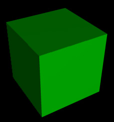
All done? Great! It's about time to cover some more objects. Not to downgrade the lovely sphere, but there are times when more varied forms are useful. We'll start with a simple box. Here's the definition for a dark green cube.
|
box { < -1, -1, -1> < 1, 1, 1> pigment {color rgb < 0, .6, 0>} } |
|
Two vectors and that pigment statement again. Can't be too bad, can it? And it's not. The two vectors determine where two opposite corners of the box reside. Thus this box goes from -1 X to 1 X, -1 Y to 1 Y, and -1 Z to 1 Z. It has edges of length 2 and is centered on the origin. It's also dark green. A more interesting box might look a bit like this:
|
box { < -2, -1, -5>< 2, -.8, 5> pigment {color rgb < 0, 0, .6>} } |
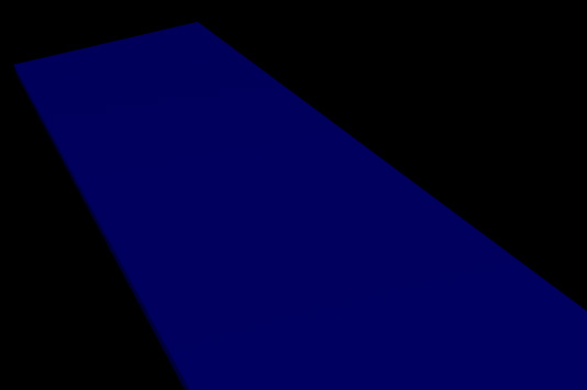
|
This box is more of a plank - a flat, long (blue!) board going from -2 to 2 X, only .2 units tall, and stretching from -5 to 5 Z. In fact, it doesn't fit on the screen as it is (unless you moved your camera), it's so long.
Anyway, that about does it for the box. There are other things we can do to it, but we can do those to all objects, so let's learn about the others first. How about putting a cylinder on the plank? Cylinders have three important components: two endpoint vectors and a radius. If you add this cylinder onto the plank, then you should get an image like that on the right.
|
cylinder { < 0, -.8, 0> < 0, 1, 0> .7 pigment {color rgb < .8, .8, 0>} } |
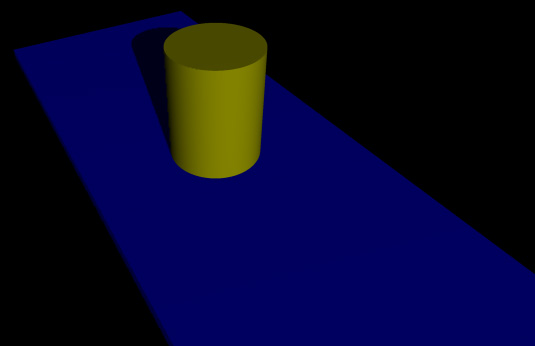
|
Our cylinder has one center at 0 X, -.8 Y, and 0 Z, and the other center at 0 X, 1 Y, and 0 Z. This makes it stand flat on the plank (which has a maximum Y value of -.8) and stand straight up. The cylinder has a radius of .7. It's also yellow (combining red and green gives yellow. Combining green and blue gives cyan. Combining blue and red gives purple.).
Notice how the cylinder casts a shadow on the plank. We get this for free because of our light source. Moving the light source around to different places will change how the shadow gets cast. Of course, if we fiddle with the plank or the cylinder, then we will also get different shadows. For example, we can turn the cylinder into a speed bump like this:
|
cylinder { < -2, 0, 0> < 2, 0, 0> 1.5 pigment {color rgb < .8, .8, 0>} } |
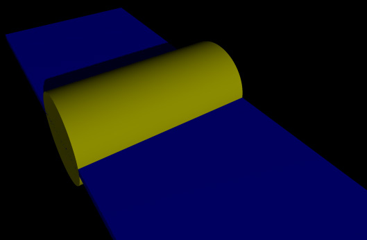
|
Okay, looks pretty good. However, I see a few blue sponts on the side of that cylinder - what's going on? A closer look at the side reveals this rather untidy image:
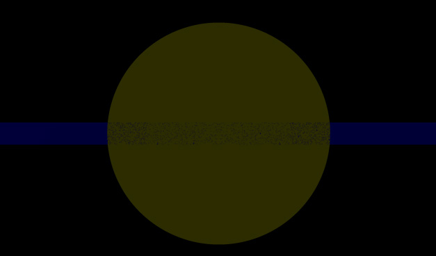
|
Ouch! That's not good. What happened here is that the edges of the cylinder and
the plank are exactly aligned (at -2 X, for reference). Thus when a light beam
strikes that area, it has an equal chance of hitting the box or the cylinder;
neither is "inside" the other. To fix this problem, we could make either the
cylinder or the box slightly more narrow (not much is needed - .01 units would
be enough). Or we could just shelve that thought and move on to more
interesting projects. For example,
WHERE ARE THE RINGS?!
Oops. Knew I forgot something. You're going to have a bit of difficulty making
maille with spheres, boxes, and cylinders. So lets move on to the next object,
the torus. I'm going to remove the plank and the cylinder now.
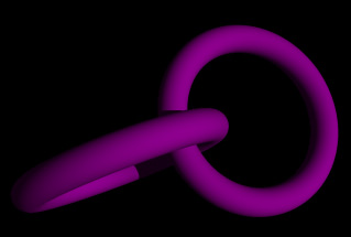
|
torus { 1.2, .2 pigment {color rgb < .7, 0, .7>} } |
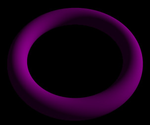
|
There we have it - one purple ring. Isn't it beautiful? Seems a bit odd, though - the thing only has two values (besides the pigment) to define it. Those two values are called the major and minor radii. The major radius represents the distance from the center of the ring to the center of the "wire"; the minor radius represents the thickness of the wire. I've found that values of 1.2 and .2 for the respective values gives a reasonably realistic ring size good for most weaves (though not the Persians).
You'll notice that the torus was centered at the origin automatically. Since it has no position vector, how do we move it around? Well, there's a simple transformation we can perform on the ring (or any other object, for that matter) called the translate transform. Translate takes a vector and moves the object according to it. So if I wanted to stack two rings on top of each other, I could use translates like this:
|
torus { 1.2, .2 translate < 0, -.3, 0> pigment {color rgb < .7, 0, .7>} } torus { 1.2, .2 translate < 0, .3, 0> pigment {color rgb < .7, 0, .7>} } |
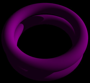
|
In this case, I moved one ring up by .3 and one ring down by .3. Notice that I put the translate command in between the torus's radii and the pigment statement. This is generally a good place to put your transformations - between the values that define the object's basic shape and the values that give it texture and color.
Okay, so translates will be useful. But I personally don't know of many weaves that consist of a bunch of rings just lying flat. The only one that comes to mind is "Oops, I spilled my rings all over the floor," and that's not a weave that many people make on purpose. How do we make rings intersect each other? We'll have to use the rotate transform. Like the translate transform, rotate uses a vector to determine how the object should be rotated around the X, Y, and Z axes. Let's return to our two rings, only this time in addition to translating them, I'm going to rotate them.
|
torus { 1.2, .2 translate < -1, 0, 0> rotate < 45, 0, 0> pigment {color rgb < .8, 0, .8>} } torus { 1.2, .2 translate < 1, 0, 0> rotate < -45, 0, 0> pigment {color rgb < .8, 0, .8>} } |
|
In this case, I only rotated them about the X axis; no point in getting things too confusing yet, is there? You can combine rotates and translates if you like, but be careful about the order! Rotating an object and then translating it will give a different result from translating an object and then rotating it. This is because objects are always rotated about the origin. If they aren't at the origin when they get rotated, then they will be moved as part of the rotation. Witness these two examples (seen from above, camera location < 0, 10, 0>, with a red cylinder to mark the origin):
|
torus { 1.2, .2 rotate < 0, -45, 0> translate < 2, 0, 0> pigment {color rgb < 0, 1, 0>} } |
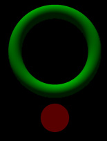
|
|
torus { 1.2, .2 translate < 2, 0, 0> rotate < 0, -45, 0> pigment {color rgb < 0, 1, 0>} } |
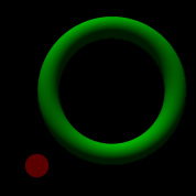
|
Now, normally rotating a torus around the Y axis doesn't do much, but if the ring's been moved off of the origin first, then it does! While this feature can occasionally be useful, I'm generally more inclined to put my rotates before my translates.
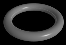
At any rate, you should have enough information to make your own virtual maille now. Unfortunately, being limited to basic colors for your rings is a bit boring. How's about we spice things up a bit? By adding finishes to your rings, you can make them quite shiny. This will make them look more metallic. Here's a sample ring with a finish applied to it:
|
torus { 1.2, .2 pigment {color rgb < .6, .6, .6>} finish {phong .4 diffuse .5 ambient .4 reflection .2} } |
|
Look at the finish statement. The phong, diffuse, ambient, and reflection keywords all represent different ways that the object can become shinier. Phong determines the size of the little light spot you can see on the lower-right of the ring. Diffuse measures how well the ring "spreads out" the light it gets. Ambient measures the amount of ambient light the object picks up - give the object lots of ambient and it will seem to glow in darkness. Reflection measures the degree to which the object reflects other objects. A value of zero here will result in no reflection, while a value of one makes the object a perfect mirror. Play around a little with these values; they're easier to understand from experience than from reading.
That should do it! Remember to practice; this stuff will become easier as you work at it, though it may well be intimidating now. Good luck!
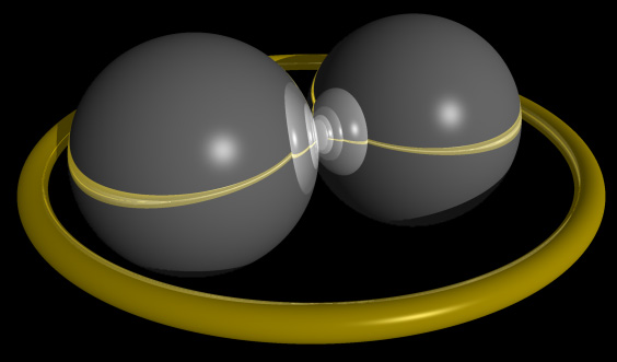
|
sphere { < -2, 0, 0> 2 pigment {color rgb < .8, .8, .8>} finish {phong .4 diffuse .4 reflection 1} } sphere { < 2, 0, 0> 2 pigment {color rgb < .8, .8, .8>} finish {phong .4 diffuse .4 reflection 1} } torus { 4.5, .2 pigment {color rgb < .7, .6, 0>} finish {phong .4 diffuse .5 ambient .4 reflection .5} } |
 |
All items on this site are copyright 2002 Chris Weisiger (a.k.a. Derakon). That's right - I made everything on this site. Reproduction of any of my work i\ n whole or in part requires my express consent.